

photo: anthony masterson
We've enjoyed getting to know the city of Atlanta. A sizable city with design conscious citizens. One of the coolest neighborhoods that has developed over the last 20 years has been the Westside Provisions District. A district of beautiful design shops with some of the cities best apparel retail (Sid and Ann Mashburn, Billy Reid) and restaurants (JCT, Marcel) among them. And smack dab in the center of this area, Dixon Rye has risen.
We are excited to share a conversation with the founder and owner of Dixon Rye, Bradley Odom.
M+M - We love your aesthetic. The idea of Raw and Refined, together. Can you tell our readers a bit about how that developed?
DR - I landed on these words to describe the brand before I opened, and I loved how they felt and sounded together, but our eventual brick and mortar shop, a 1943 building that served as an Iron Foundry provided the perfect backdrop to visually communicate this aesthetic. Our physical space provides the raw, with soaring ceilings, the original crane and pulley systems, concrete walls, and weathered, hardwood floors. Because of this, we are uniquely positioned to play with the juxtaposition of humble materials (steel, wood, concrete), with luxe and soft materials (linen, cashmere, velvet). But even in the most refined spaces, there can be raw or humble materials that add to the mix of raw and refined.

photo: sarah dorio
M+M - “Quiet decency” is a defining phrase for your brand. We love the sound of it. For us it feels “comfortable and elegant”. The combination of which we would want to buy into. What else does it mean to you?
DR - Quiet Decency is a visual inspiration of the things I love myself that I think reflect Dixon Rye. It also feels quiet in that there’s no sales or promotional component to the email. Our inboxes are full of noise, and we wanted this to feel like a breath
of quiet inspiration. When we get compliments like, "I read Quiet Decency with my morning coffee", or "Thank you for bringing more beauty to the world", that inspires me to keep going! I've always been a visual learner and have always taught from the point of inspiration, so QD is a great outlet
M+M - What came first for Dixon Rye? Design or commerce? How do they overlap?
DR - I’m a retailer at heart. Curating the shop has been a dream, but curating the assortment in the homes of our customers that is unique to their life and experiences has always been a component of the vision. There’s something about being a shopkeeper that inspires me. I get to work with our customers on a daily basis. I learn from each one about where and what we do next. That isn’t to say the design part of our business isn’t important—it is. I get to extend what we do in the shop into peoples homes.
M+M - What was the moment when you said to yourself ... “I’m going to start a brand”?
DR - I’ve always been inspired by the opportunity to create an endeavor from the ground up, and I can’t say that there was one “aha!” moment; it’s been an awareness for as long as I can remember. I do have one memory of standing in my favorite store in Birmingham at the age of 26 and specifically knowing that I wanted to have my own home store one day. I’ve been fortunate in my career to witness the development of brands from ideation to inception to execution and have always known the dream was to do this with some of my own ideas. Having worked for J. Crew, West Elm and others, the idea of a “shop” to me while it may only be one, always equaled all of the tangibles and intangibles that go into creating a brand. Earning a degree from SCAD several years ago was one of the final pieces of the puzzle I wanted to complete before going full steam ahead with Dixon Rye.
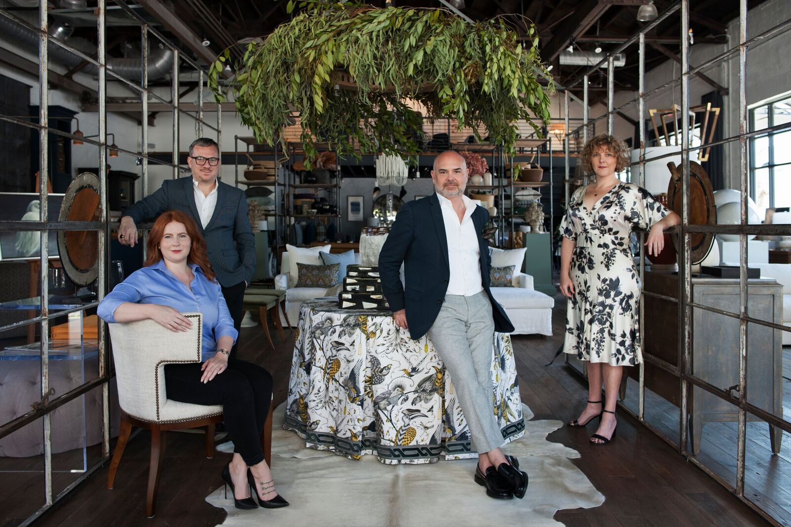
photo: anthony masterson
M+M - We’ve enjoyed multiple interactions with the fine folks on your team. It is always a pleasure and they are always engaged. Will you share a bit about how to build a successful team?
DR - I’ve always believed that you shouldn’t hire anyone you wouldn’t share a drink or meal with, and that rule has served me well.
I think the push for brick-and-mortar shops to innovate to keep up with e-commerce is overthought and overcomplicated. Of course we focus on innovation in terms bettering all points of consumer engagement, but at the end of the day, it seems like the most innovative thing that we can do is to honor the legacy of the small shop owner. We build relationships, we serve beverages, we send thank you notes, and at the end of the day we make friends, who are our biggest brand ambassadors. My team and I share (and often revisit) this same philosophy; in terms of in-store client relationships, we focus more on intention than innovation.

photo: anthony masterson
M+M - You are from a small town in Mississippi. How has that influenced you?
DR - I was born and raised in a small, rural town in Mississippi, but have also lived in several distinctly different southern towns: New Orleans, Birmingham and my long- time home, Atlanta. The rich heritage of the South informs not only how I design, but also how I work with clients: family first, entertaining, outdoor/indoor living, lush greenery, inviting spaces and personal stories reflected in everyday objects.
M+M - How did you make your way to Atlanta?
DR - The long and winding road of retail, of course.

photo: sarah dorio
M+M - What do you see as the biggest trends in home design for Atlanta over the next 5 years?
DR - You know, I try not to dive too much into trend forecasting, however, I can tell you what I would like to see. I would love the use of more color and modern done well. I think modern gets a bad wrap in the South because of how modern sometimes gets translated. The word alone tends to scare some people. Modern can be approachable. Doesn’t have to be cold. Those who pull it off understand the mix, scale and editing of design. Throw in that antique chest, it helps to ground some of the more modern choices!
M+M - We appreciate the name “Dixon Rye”. How did you come up with the name for your company?
DR - I wish the story was more glamorous than, “We were unable to obtain the full rights to the original name that’s been part of this process for years”, but that’s the truth. Several months before the shop opened, we had to go back to the drawing board. With the creative support and assistance of several of my friends, colleagues and mentors, the fictitious character of Dixon Rye was born.
I wanted the name to have a southern influence without being 'hokey.' Dixon was taken from Mason Dixon and Rye was inspired by Catcher in the Rye, or whiskey, depending on who you ask.
M+M - What is in the near future for you and your brand?
DR - In the next month we’ll expand our online offerings to a full e-commerce site, so that’s been our biggest focus this year. We’re also approaching our third anniversary, so I felt like it was time for a full website update. It’s time for this to happen, and it’s been our biggest labor of love in 2018; I can’t wait for you to see it.
M+M - What are the long term goals for Dixon Rye?
DR - I want to pace our growth and make sure that we’re really committed to the excellence of our small brand before it becomes a bigger one. I think having a e- commerce site will dictate our next steps in regard to photo studio, design office, warehousing—all the behind the scenes things. We’ll also continue to develop our own private label collection into other categories.

photo: sarah dorio

photo: sarah dorio